Widget design
You can make the chat widget look like part of your store in a few minutes. This page covers the appearance settings and the texts customers see first.
Appearance lives on AI Assistant → Settings → Design. The bot’s name, welcome message and conversation starters are on Settings → Behavior.
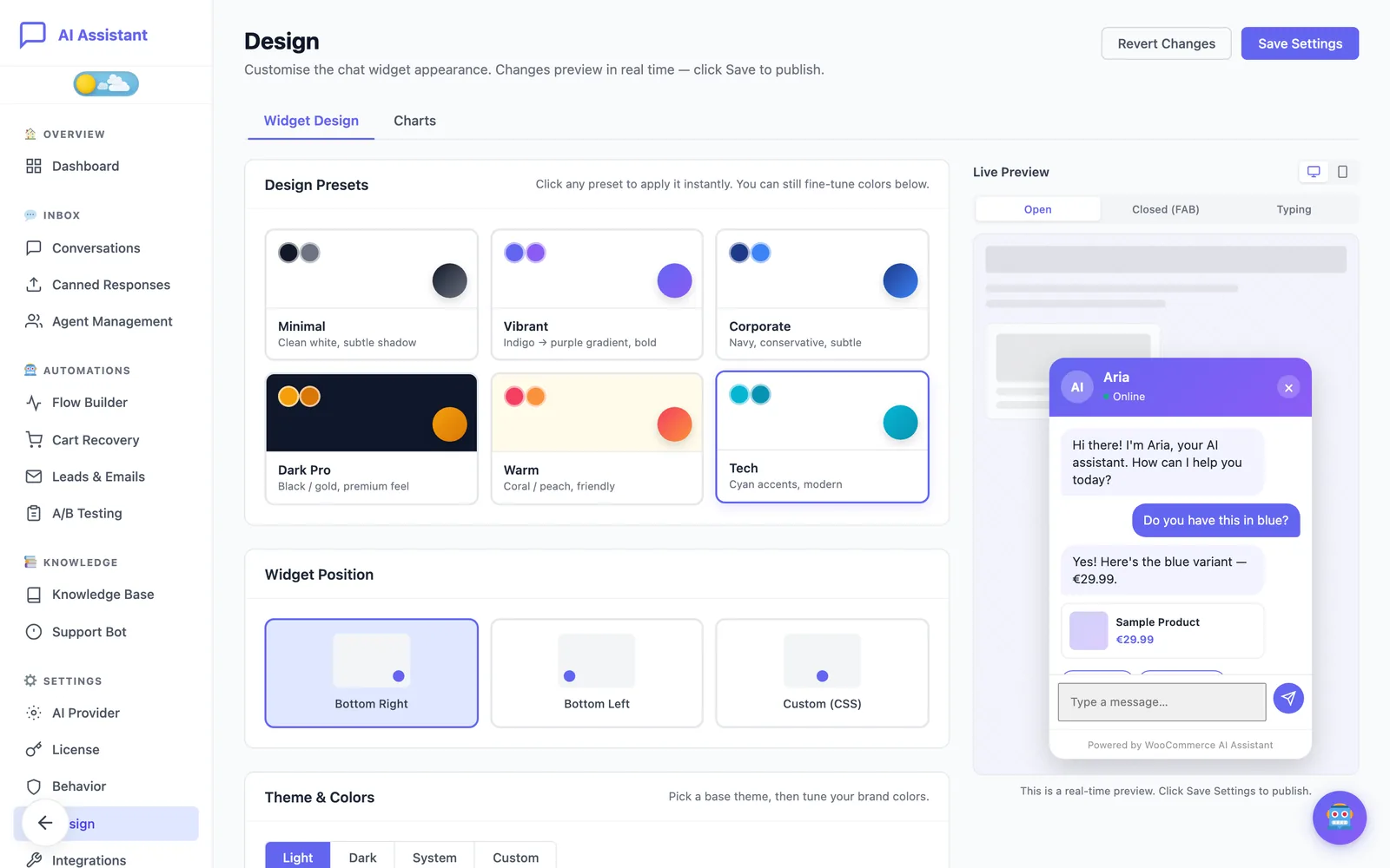
Work with the live preview
Every change shows immediately in the Live Preview. Switch it between desktop and mobile, and between the open chat, the closed chat button and the typing state. Nothing reaches your store until you click Save Settings; Revert Changes discards what you have not saved.
Start from a preset
- Under Design Presets, click one of the six presets: Minimal, Vibrant, Corporate, Dark Pro, Warm or Tech.
- Check the result in the preview.
- Fine-tune the colours below if needed, then click Save Settings.
Set your own theme and colours
Under Theme & Colors, choose a base theme: Light, Dark, System (follows the visitor’s device) or Custom. The four colour pickers (primary, secondary, background and text) are applied only when the theme is Custom.
The screen shows a contrast check next to the primary and text colours. Keep it passing so the header and messages stay readable.
Choose the position
Under Widget Position, pick Bottom Right, Bottom Left or Custom (CSS) if another element, such as a cookie banner or a back-to-top button, already occupies the corner.
Adjust typography, shape and size
- Font Family: enter the name of a font your theme already loads, so the widget matches your site.
- Border Radius: Square, Rounded or Pill.
- Dimensions: the widget width and height in pixels, and the size of the chat button.
- Animation: Slide Up, Fade or Bounce when the chat opens.
Set the bot name and avatar
- On Settings → Behavior, under Bot Identity, enter the Bot Name and the Bot Role / Title. Both appear in the chat header.
- On Settings → Design, under Avatar, choose Initials and enter one or two characters.
- Or choose Custom Image and pick an image from the Media Library. Square images work best because the avatar is small.
Write the welcome message and conversation starters
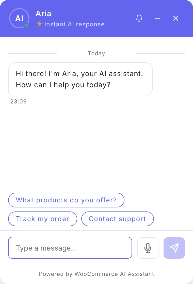
These are on Settings → Behavior. The Welcome Message is the first message in a new chat. Conversation Starters are the buttons shown under it before the customer types.
- Click + Add Starter and type the question as a customer would ask it. You can have up to six.
- Drag the handles to reorder them.
- Click Save Settings.
Choose starters that your knowledge base answers well, such as “Track my order” or your return policy. They are the first impression of the assistant.
Change the footer text
The widget footer can show a “Powered by” line. It is off by default. Under Footer on the Design screen you switch it on or off, edit its text and change its colour.
Choose where the widget appears
Under Settings → Behavior → Features:
- Auto-Inject on All Pages shows the widget across the site. Turn it off to place the widget only where you add the
[ecomai_chatbot]shortcode. - Show on Checkout keeps the chat available on the checkout page. Turn it off if you want no distraction there.
Remember that logged-in administrators don’t see the widget on the store. Use a private window to check your design.
Still stuck?
Check the troubleshooting guide, or contact support and tell us what you tried.